I was showing my kitty how to do art on the iPad, and this is what we came up with! LOL.


I was showing my kitty how to do art on the iPad, and this is what we came up with! LOL.
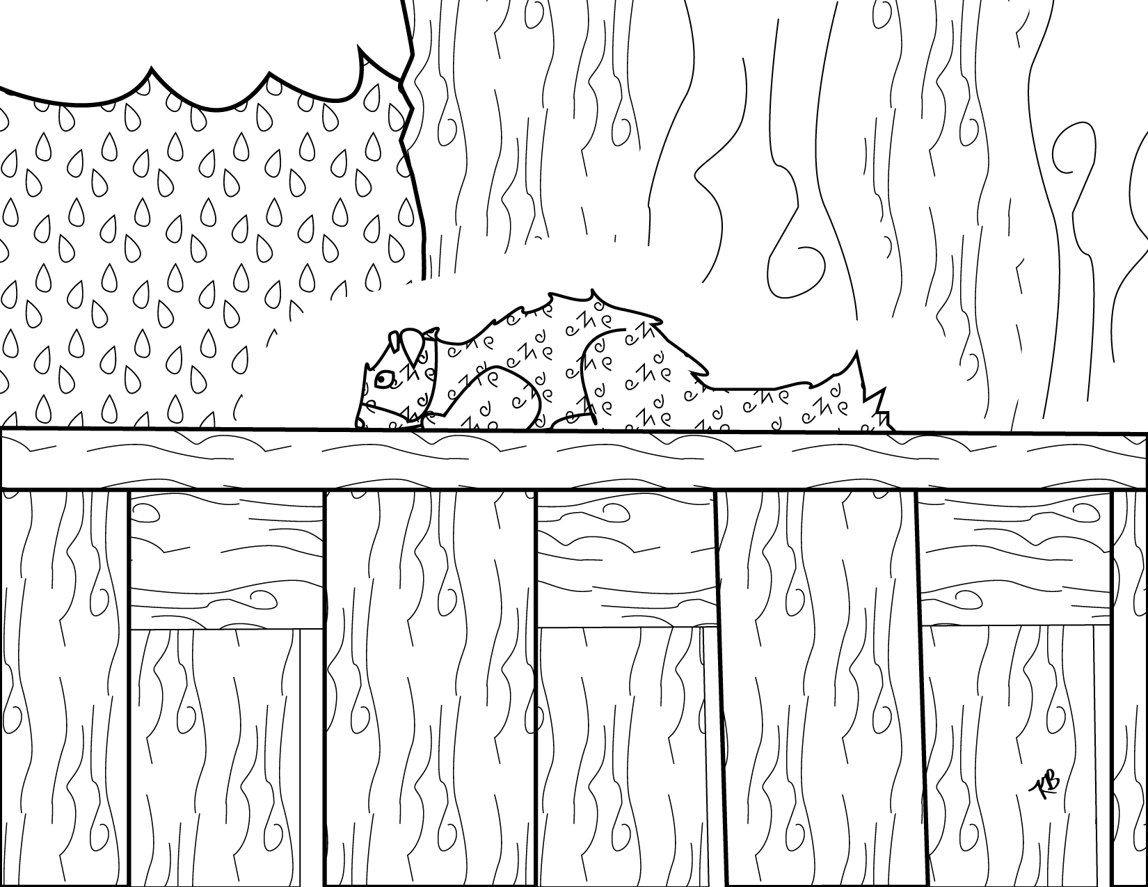
We have a family of squirrels that run around in our backyard. This is one of them resting on top of the fence. They enjoy hiding nuts in all of my mom’s plants and drinking from the cat’s water dish! haha. Feel free to print and color. Will fit on an 8-1/2 x 11 piece of paper.
I had to make this, because my parents are big Oregon Ducks fans. They were watching the Ducks WIN today, so I thought I’d poke the Oregon State Beavers and the University of Washington Huskies with this comic. LOL. Feel free to download and print it off to color. It will fit on an 8-1/2 x 11 piece of paper. I recommend borderless printing if your printer can do that, but it isn’t necessary. Enjoy! Go Ducks!

Here’s my newest coloring page. This is an amalgamation of NYC. Feel free to download, print and color. It should fit on an 8-1/2 x 11 page, and if you can do borderless printing I’d recommend it. Cheers!

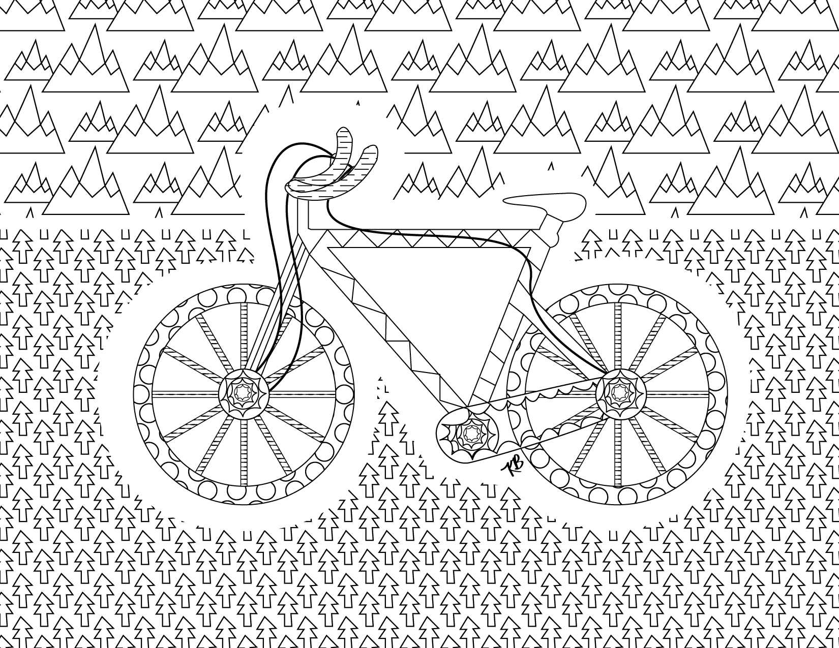
I just made this bike coloring page for a special person, but you all can enjoy it if you like. Feel free to download and color. It can be printed on an 8-1/2 x 11 piece of paper. Borderless printing is best if you can do that with your printer. Enjoy! :)
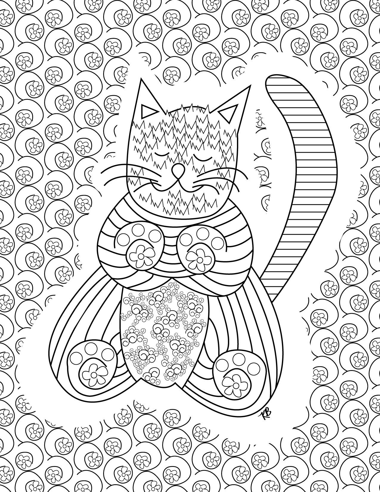
Hi everyone! Long time no see. I just made this kitty coloring page for everybody. You can download it and print it off on an 8-1/2 x 11 piece of paper. I suggest borderless printing if your printer has the capability to do that. I hope you enjoy it! Feel free to post any coloring you do.


Thought you all might like to know about Hollis Sigler. I’m just reading her Breast Cancer Journal right now. I’m not going to write a whole bio here, but just wanted to alert you to her work. She is best known for her images that relate to her struggle with breast cancer. Her story is very moving. Check out more about her at the Hammer Gallery and here.

All Over Pandas Fabric

Pandas Stripe Fabric
Two of three of my panda fabrics arrived today from spoonflower! Yay! I think they look really cute! The third one (that might come tomorrow) has dots. I’ll post that when it arrives too! :) Yay for pandas! :)
Oh, and here are the links for the fabrics:
All over pandas: http://www.spoonflower.com/fabric/1202926
Panda stripes: http://www.spoonflower.com/fabric/1202991

More Calc2 Fabric

Orange Chevrons with Balloons
I made another Calculus fabric through spoonflower (http://www.spoonflower.com/fabric/1187406), because I was so excited about my first Calculus fabric. Well, the material arrived in the mail today! How exciting!!! I also got my design of balloons on orange chevrons, but I have to work on perfecting the chevrons and getting it how I like it. So fun to get fabric in the mail! :) Click the photos for a larger view. :)
Process:
I was reading a book by Marsha Linehan, the creator of Dialectical Behavior Therapy treatment for people with Borderline Personality Disorder, and I was struck by the theoretical concepts that she was discussing in the book. At the same time, I had been thinking about my friend who has BPD. I thought about the unending pain she suffers and how there is so much rage and turmoil in her life. I wanted to incorporate both Linehan’s concepts and aspects of my friend into the art journal that I just started working on as a collaboration with my friend, John.
So, John began the journal by preparing many pages and providing inspirations and prompts, then he mailed it to me and it was my turn to lay down something on the pages.
The first thing I did was use a handheld scanning pen to scan vertical snippets of text from the Linehan book. I then printed out the scans and cut them up into various pieces. You can just make out some of the text, like the words “dysfunction” and “BPD” and “DBT” if you look closely at the first piece.
Next, I began by glueing down the various text scans onto the journal…all over the top of what my friend John had already done. You can see bits of the yellow wash that he had laid down already. I added handwritten elements with text that expressed how I felt about my friend with BPD. Some are “rage and flounder,” “escape impossible,” “improbable at best,” and “hermedically sealed” (which I spelled wrong, but ends up being seen as “medically sealed” in the final product which I think is just as good and apt).
I colored over parts with a reddish pen, because for me, reddish colors always seem to represent pain and suffering, if not outright blood. I also used my label maker to add “A FACE TO YOUR PAIN,” because I felt like this was my way of giving her pain a face. There is also a scrunched up scribble of a face contorted with pain on the journal page just above the label. Then I started adding layers of cut out graph paper, because I wanted part of the image to have some linear and quantifiable aspects, like the discreet squares of red in contrast to the smudgy blob of red elsewhere. I also added a cut out plastic sleeve that I applied color to.
I then decided that I wanted to cut out some of the page and expose the treatment that was done on the other side of the page by my friend John. I likened this to an escape hatch to relieve the immense pressure and pain of the page and my friend’s actual pain. I cut out “hermedically sealed,” which is how it seems my friend’s pain is stored, and I pasted it onto the next page so that it could be seen as “medically sealed” through the cutout. A lot of my friend’s history involves intense and traumatic encounters with the medical establishment, so I thought this was appropriate. I cut out and folded over some of the page to make more linear elements and to add to the color use on the page as well. I also wanted to do this to incorporate the idea of overlapping aspects of our lives and our histories.
When I cut out “hermedically sealed” it left an opening that for me seemed like a window and represents the hope I still have for my friend despite what seems like endless suffering. I painted the page that can be seen underneath with blues and greens to represent the sky and grass, and I placed a puffy Hello Kitty sticker in the window as a kind of whimsical “hello” with friendship. Part of the other cutout seemed organic and flower-like to me, so I also added a stem of a flower for more aspects of light and living, but also change and death. With some of the folded over cutouts I felt like there was too much color and light, so I blacked out the spaces with a magnum black Sharpie.
Throughout the process, I was concerned not only with symbolic aspects of representation, but also with the aesthetic elements of line, color, space, balance, etc. So, part of the experiment was definitely symbolic, but I also spent time adjusting the image elements to try to make an interesting and unifying picture.
When I felt like I was done with the journal page, I took a photograph of it and posted it to Facebook to keep track of the process aspect of the journaling project. I was then compelled to go further with the image by enlarging parts of the image and cropping them in interesting ways. I took snapshots of the screen with my iPad and then emailed them to my desktop machine where I processed them in Photoshop and then printed them out. I really didn’t know how they would look printed out or if I would use or like them at that point.
I liked how the prints looked, but I felt they really should be juxtaposed somehow, so I combined them.
The closeup crops that I made were deliberate. I based my decisions on aesthetics and also on what words would be incorporated into the image. “A FACE TO YOUR PAIN” was cropped into “TO YOUR PAIN” for one image and “OUR PAIN” for another image. I wanted to bring together these two aspects of the experience of pain, the self and the other, and comment on the interaction between the two. For my friend who suffers, it seems that her pain is hers alone and that it is an isolated state of suffering, but she also has friends, family and care providers who care about her and interact with her pain and suffering. We, of course, have our own pain and suffering, but seeing her in pain is also difficult and informs our own pain and our own worldview.
When I combined the crop prints, I was “mindful” of the tension between the different images on the page and wanted to incorporate Linehan’s ideas about thesis, antithesis and synthesis in the overall picture. For me, the synthesis is the final completed work, but up until then I felt that I was going back and forth trying to find the finished piece. I felt that I needed to bridge the piece to make it more cohesive, so I added a red ribbon that tied the gaps that I saw together, also tying my friend to the world and people outside of herself. I then added sculpted copper wire to put back in a bit of the organic that I thought was lost and to act as a core and a crowning jewel.
For the second image, I employed much the same process. I printed out crops of the journal and then cut and fit the pieces together like a puzzle. For me, the second piece is more about hope, so I used the “A Window Opens” text in part of it and the overall image is less dark and red. The border of the image is a handwritten excerpt from Linehan’s text that talks about dialectics and how it is a process that persuades and encourages movement. I used the red yarn to imply some movement, but also tension. The yarn is tight, but not so tight that it tears the page. It also helps to unify the image I think, adding that aspect of synthesis.
 The journal page.
 The first finished piece.
 The second finished piece.
